What are Primary Colours?
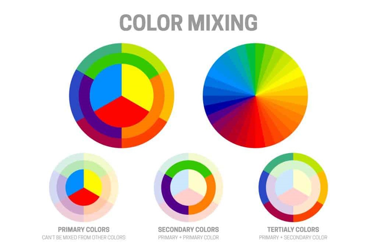
The term “primary colors” refers to colors that cannot be created by combining any other colors. They are the primary colors that comprise the color spectrum and serve as the foundation for the creation of all other colors.
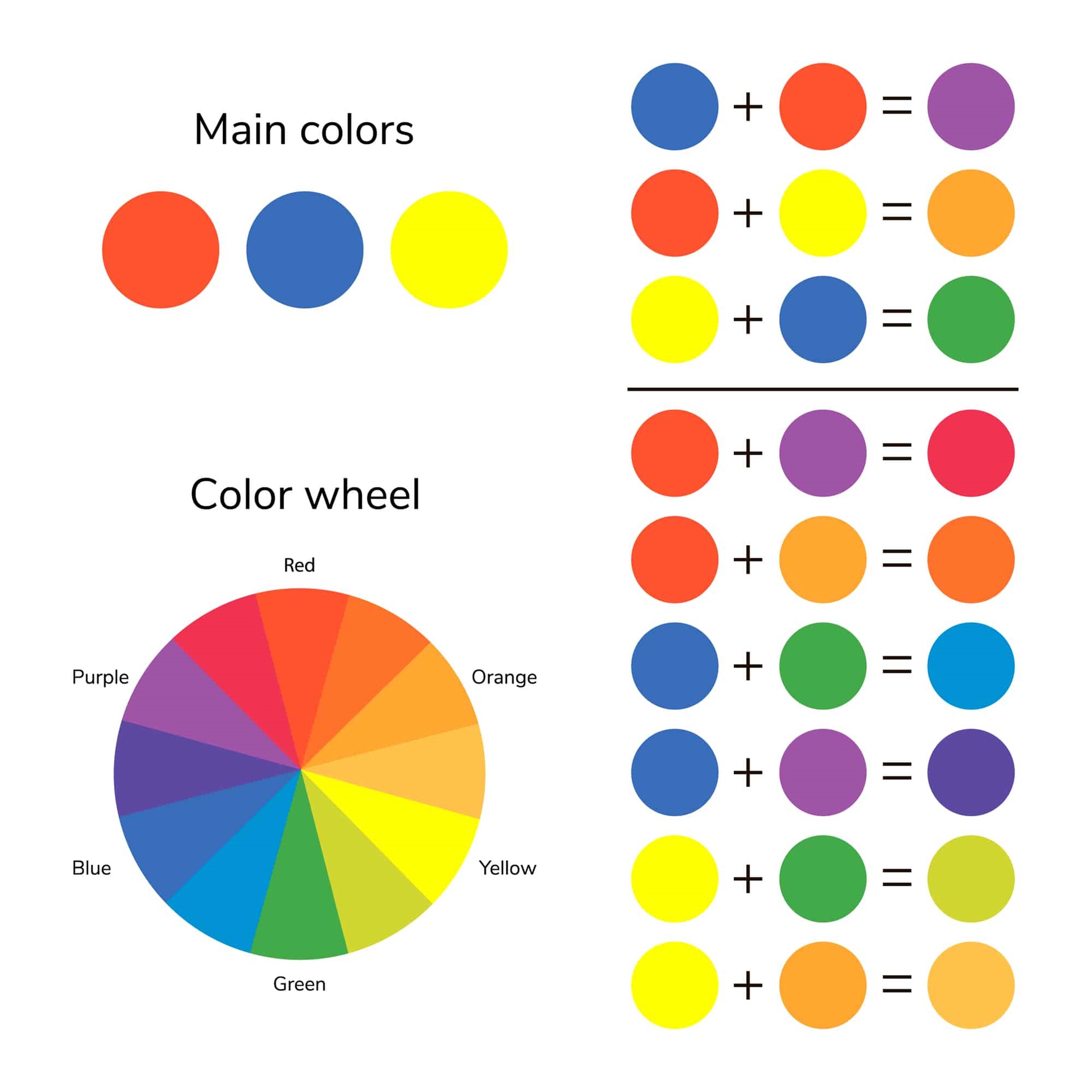
Red, yellow, and blue are the three colors that make up the main pigments in the standard color wheel. Because they are the most fundamental colors, these hues are referred to as primary colors. Virtually any color can be produced by combining these primary colors in a variety of proportions and permutations to produce a new hue. Because of their prevalence in the visual arts, the conventional color wheel designates red, yellow, and blue as the primary colors. Blue, yellow, and red are the colors that are utilized the most frequently. Additionally, these colors are the ones that are utilized in the majority of the color printing techniques, such as screen printing and offset printing. Electronic displays, such as those seen in televisions, computer monitors, and other types of screens, also make use of the fundamental colors.
Because they are the foundation upon which all other colors are built, primary colors are extremely significant. A secondary color is produced by combining two main colors in the correct proportions. For instance, orange is produced when the colors red and yellow are mixed together. The color green is produced by combining the colors blue and yellow in the appropriate proportions. And the color purple is the result of combining blue and red in the appropriate proportions.
The subtractive color wheel is one example of a color wheel that uses a different set of primary colors than the additive color wheel. This color wheel is utilized in the printing business. Cyan, magenta, and yellow are the main colors that make up the subtractive color wheel. These hues are referred to as “subtractive” due to the fact that they absorb some wavelengths of light while reflecting others, which is what causes the human eye to see color. The color black is produced when cyan, magenta, and yellow are combined in the same container and stirred.
Other color models, such as the RGB color model, which is utilized in electronic displays, make use of distinct colors as its basic building blocks. Red, green, and blue are the three fundamental colors that make up the RGB color model. Because these are the colors that are utilized in the production of all other colors on a computer or television screen, these colors are referred to as fundamental colors. The three primary colors of the rainbow, red, green, and blue, when combined in varying proportions, produce a vast array of colors.
The fashion and design industries both place a strong emphasis on the use of primary colors. When it comes to interior design, primary colors are frequently utilized to achieve a look that is either striking and lively or one that conveys a feeling of equilibrium and harmony.
Because of the prevalence of particular meanings and feelings linked with them, primary colors are also utilized in the branding and marketing processes. It is common practice to utilize the color red to represent vigor, passion, and excitement. On the other hand, the color blue is connected with serenity, trust, and dependability. Yellow is a color that is frequently used to communicate joy, pleasure, and warmth.

In what ways do basic colors appear in the world of fashion?
In the world of fashion, primary colors are responsible for the creation of a vast array of styles, ranging from daring and vivid to subtle and exquisite. Numerous fashion designers construct the foundation of their color palettes out of the main colors, and then they experiment with combining a variety of tints and hues of those primary colors to produce an extensive variety of styles.
The use of color blocking is one of the key ways that primary colors are put to use in the fashion industry. In fashion, this refers to the use of huge blocks or blocks of primary colors in an ensemble, such as a red shirt worn with yellow slacks. Blocking colors together can be a daring and striking way to create a statement, and you’ll frequently see this technique utilized in high fashion and on the runway.
In the world of fashion, primary colors can also be utilized in more understated ways, such as via the use of accessories or accents. A yellow scarf or a green belt, for example, may lend a touch of brightness and cheerfulness to an outfit, while a red purse or a pair of blue shoes can bring a splash of color to an ensemble.
In addition to their usage as individual hues, primary colors may also be combined in a variety of ways to produce an extensive palette of secondary and tertiary hues. For instance, the color orange is created when red and yellow are united, but the color green is produced when blue and yellow are brought together. In the world of fashion, one of the best ways to produce a color palette that is more varied and exciting is to combine and contrast the fundamental colors.
Additionally, primary colors are frequently employed in the fashion industry to communicate specific feelings and meanings. The color red, which is frequently utilized in the fashion industry to produce a style that is daring and energetic, is commonly linked with vigor, ardor, and excitement. Blue is a color that is frequently linked with serenity, trust, and dependability, and it is frequently utilized in the fashion industry to produce an appearance that is more refined and attractive. Yellow is a color that is frequently linked with joy, pleasure, and warmth. It is also a color that is frequently used in the fashion industry to lend a touch of brightness and cheerfulness to an outfit.
In the fashion business, primary colors are frequently utilized in the process of branding and marketing, in addition to their applications in apparel and accessories. In order to transmit certain sentiments and meanings and to differentiate themselves from competitors in a crowded market, companies often utilize primary colors in the design of their logos, packaging, and other marketing materials.
If you want to create fashion looks that are dynamic and striking, it is helpful to have a working knowledge of how to employ primary colors. This is true whether you are a fashion designer or just someone who wants to add a splash of color to their wardrobe.

Combinations of the main colors that are most frequently used
When primary colors are combined, a large range of secondary and tertiary colors are produced. These secondary and tertiary colors can then be combined in a variety of different ways to produce a vast range of various appearances and effects.
The combination of red, yellow, and blue is commonly referred to as the “primary color triad,” and it is one of the more common primary color combinations. This combination produces an eye-catching and vivid appearance, which is frequently utilized in the fields of art and design to achieve a sense of equilibrium and harmony.
There are two ways to employ the colors red, yellow, and blue: either in proportions that are equal to one another, or with one color serving as an emphasis against the other two.
Orange, which is created when the main colors red and yellow are combined, is yet another common color combination. Orange is a well-liked hue, particularly in the realms of fashion and interior design, and is commonly thought to connote warmth, happiness, and vitality.
You may make orange by mixing equal parts red and yellow, or you can choose to highlight one color by contrasting it with the other. Either way, orange is created.
The combination of blue and yellow, which results in green, is the third primary color combination that is frequently used. The color green is often used in the worlds of fashion and design because of its popularity and the common associations it has with things like nature, growth, and rejuvenation.
You may make a true green by combining equal parts of blue and yellow, or you can choose to highlight one color against the other. Either way, green is the result.
In addition to these color combinations including fundamental hues, there are a great number of other color combinations that are common in the worlds of art, design, and fashion. Take, for instance:
-
Red and blue can be mixed together to create purple, which is often associated with creativity, mystery, and spirituality.
-
Yellow and blue can be mixed together to create the colour green, which is often associated with nature, growth, and renewal.
-
And red, yellow, and blue can be mixed together in different proportions to create a wide range of tertiary colours, such as yellow-green, blue-green, and red-orange.
Primary colours can also be combined with other colours to create a wide range of looks and effects. For example, primary colours can be paired with neutral colours, such as black, white, and grey, to create a sophisticated and elegant look. Primary colours can also be paired with pastel colours, such as light pink and light blue, to create a softer and more feminine look.
Whether you are an artist, designer, or fashion enthusiast, understanding how to mix and match primary colours can help you create dynamic and impactful colour palettes.
Conclusion
In summary, primary colours are the fundamental colours that make up the colour spectrum and are the basis for all other colours. They are important in art, design, and branding and are used to create a wide range of looks and emotions. Whether you are an artist, designer, or marketer, understanding the primary colours and how they work together is essential for creating effective and impactful designs.

Leave a reply